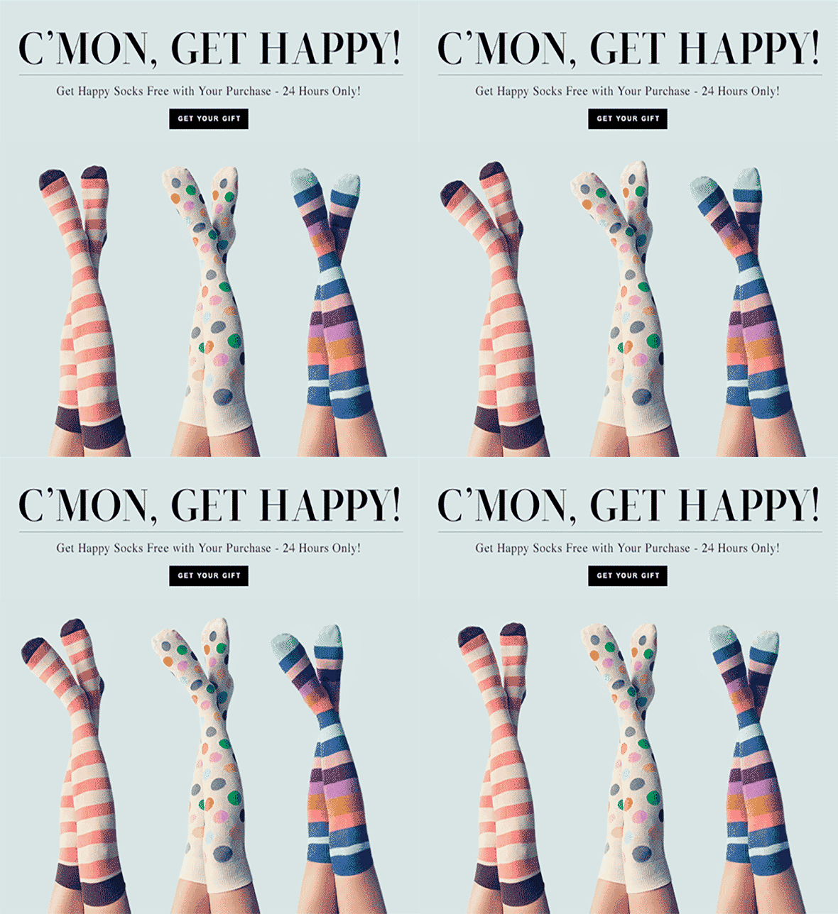
No matter whether you’re a B2B or a B2C company, your digital advertising channels extend to Facebook, Twitter, Instagram, Google Adwords, PPC etc. All of them are centered around visuals and images are the go-to content in your digital advertising efforts. You will need plenty of them to stay in front of your audience’s eyes.
The great news is, you don’t need to hire a designer for creating perfect images for ads. We are going to show you what best practices to follow to design stunning static ads.
1. One ad – one message
Resist the temptation to include EVERYTHING into a single advertisement. You have a limited space and very limited time to bring your message across – so, focus on ONE thing to make clear, which should be supported both by the image and text.

2. Use no more than 20% of image space for text
First of all, if you’re creating an ad for Facebook, it won’t let you publish it till it’s happy with the amount of text on the image.
Secondly, there’s no point in writing a too extensive copy, users just glance on the ads in their newsfeeds or sidebars, so the shorter and clearer-the better.
Finally, make sure your text is readable – avoid fancy fonts or using fine print – in all probability, no one will take the time to decipher it.

3. Use stock photos wisely – and creatively
Everyone is using stock photography, and that’s ok. But you don’t want to be like everyone else, right?
So, first – avoid free stock photos, they are unbelievably trite and used extensively.
Secondly, if you do need to use a free generic photo (or even a paid one), play with it to make it unique. There are tons of tools to help you transform the picture – use filters, color overlay, unexpected visual elements, parts of other pictures etc.
Look how how this medicine advertisement is different from the traditional ads of the type with their clean blank design – thanks to the bright elements and print.

4. Be consistent with design to improve brand recognition
If you want your ads to stand out of the rest and be easily recognized, create your individual style. For example:
- use the corporate/website colours in your ads
- if you want to play with background colours, leave the font and foreground unchanged
- if you’re switching between different messages, keep the background.
This example from Holini shows how using light purple colour overlay not only helps them instantly differentiate their ads, but also makes stock photos look unique.

Marketo always uses colour purple in its ads, which makes it distinct.

5. It’s not just about photos
You don’t necessarily need to show people on your ads, or use photos at all. There are tons of other forms of visual content, like graphs, diagrams, infographics, charts, graphics – all of them can make great ads.
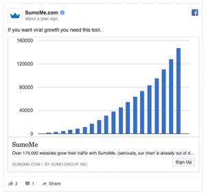
For instance, SumoMe uses a visual representation of its services – increasing website traffic, and it looks very compelling.

6. Use well-known names/brands/logos in your ads
If you include something people already know, trust and have positive associations with, they will perceive your brand positively.
For instance, if you’re associated with famous companies or provide services for them, don’t be shy to demonstrate it.
Look how others do this:

Sanebox is intended for users of various email services, but showing the well-known Gmail logo helps them earn credibility.
7. Test, test, test
Similarly to website design, with ads there’s no magic “effectiveness pill”. Even the most beautiful and quality static ad can be totally ineffective. What works for others may not work for you. A variation of colour, background or line of text can make a huge difference.
Aside from testing, there’s not much you can do to find your secret to success. So, if you’re vague about certain design elements or want to reach maximum effectiveness, plunge into A/B testing your ads – you can be totally surprised to find out what works best.
Important! Don’t change more than one element at a time for the sake of accuracy. Otherwise, you won’t know what caused the change in results.
If you don’t know where to start with your static ads, close your eyes and think what visual could most accurately demonstrate the concept of your product or service – find or create the suitable one, complete it with a compelling copy and don’t forget a call to action.
Once your artwork is ready, you can get it in front of your audience in no time with TRACKLAM – simply sign up, choose the channels and media – upload the ads and track their performance. Placing all types of ads (even OOH), in a few clicks, fast and easy.
Try today!


